04-30-15
Design in Detail- A Dramatic Before and After
Spring has been an exciting time for me between my travels, work projects and to have the opportunity to participate again in the 2015 DC Design House. This was my third time Ive designed a room for the Design House and it was a first to be in McLean, Virginia this year. The house was inspired by local farmhouses in the area and was thoughtfully designed and executed by Artisan Builders.
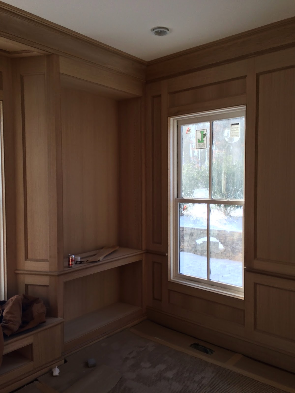
When I first went to look at the house to select a room I didn’t have to look any further then the library located in a sunny corner of the house next to the living room and terminating a long gallery- hallway at the rear of the house facing the gardens. I was immediately drawn to the intimate scale of the space and adore designing libraries so it was a no brainer for me. I thought it would be fun to share the before and after photos and also my I took for the design.
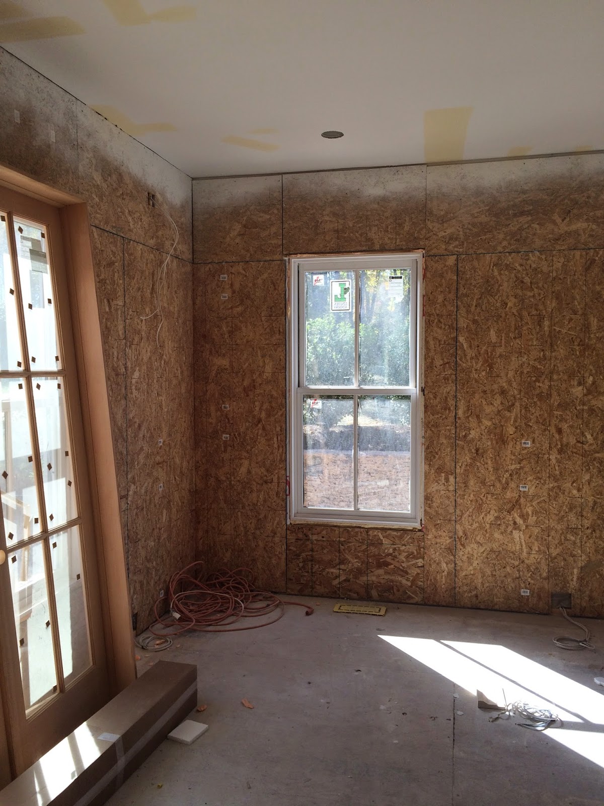
Here is the library in its very raw state on the first day I saw it. The walls are covered with plywood but I could already get a sense of what the room could be.
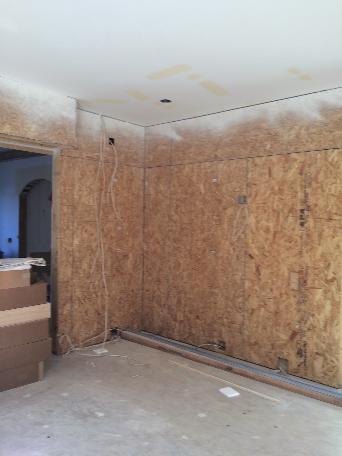
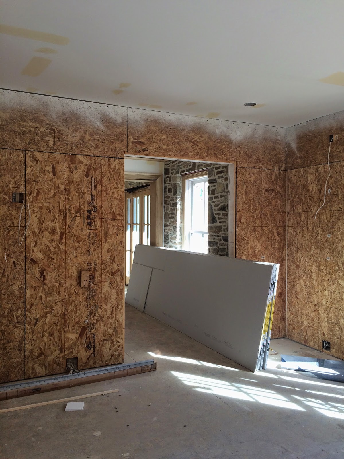
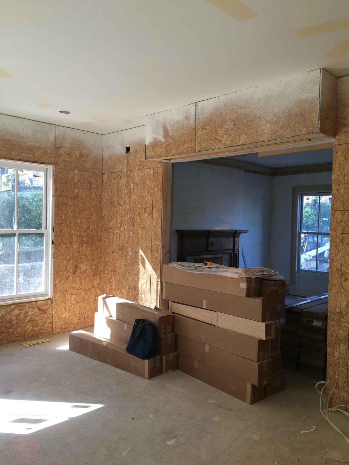
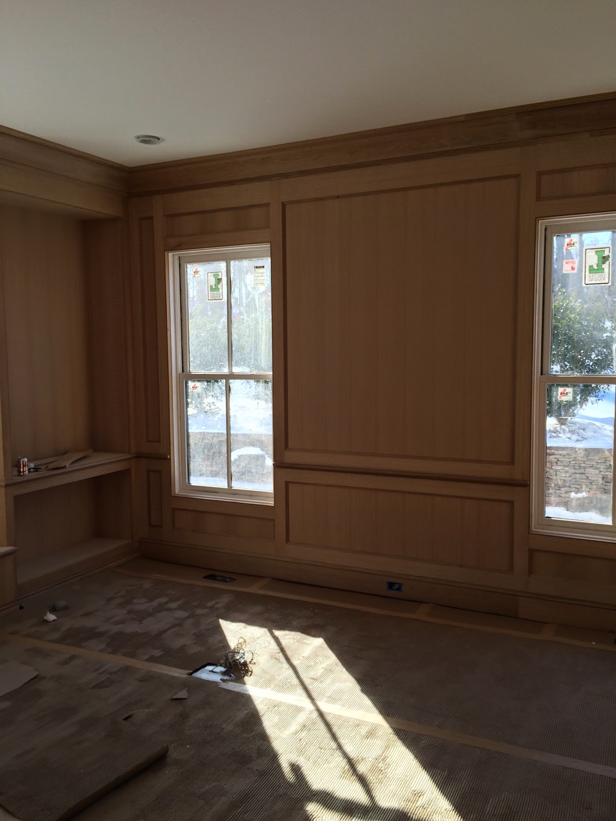
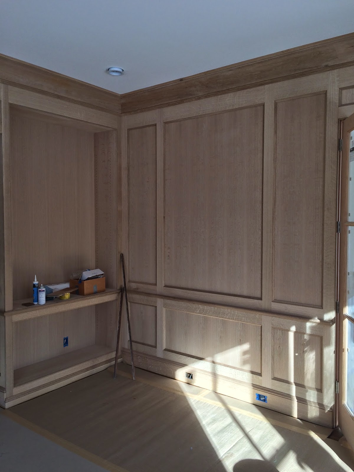
For the paneling and built in bookcases I knew I wanted the room to have a more relaxed and less formal feel, which I felt respected the farmhouse architecture of the house. So I chose a quarter sawn oak with beautiful and consistent graining. Here is the oak paneling in its raw and unfinished state. It was a great experience and process to work with Artisan Builders on the design.
I worked closely with the finisher to achieve a lighter color for the stain. I did not want the room to become too dark or masculine. I also wanted it to coordinate with the reclaimed wood mantle in the adjacent living room as well as the field stone walls and rustic beams on the other side of the house. Creating a connection and consistency between both sides. The junction boxes for the wall sconces and picture lights have yet to be installed.
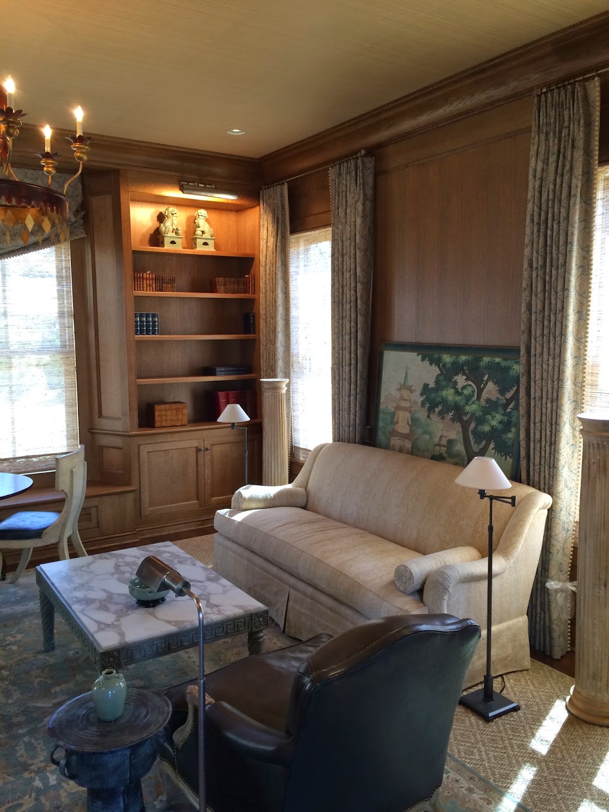
Here is the first stage of installing the room with the gorgeous chinoiserie painted panel by John Rosselli. It was one of the first pieces I found for the room and knew it would be the perfect focal point. Knowing early on that I was going to use the painting I was able to have the recessed panel made to fit the painting perfectly. So you could say we literally built the room around it. The painting truly inspired the color palette and overall mood of the library. I wanted to use paler versions of coordinating greens throughout with punctuations of complementary reds as my accent color.
The O Henry House sofa, also from John Rosselli, upholstered in a faux bois patterned fabric by Jed Johnson fit the space between the windows perfectly!
The installation continues with accessories, books, petite reading lamps and an amazing leather club chair from Minton Spidell. Its one of the most comfortable chairs I have sat in and it has a lovely bleached oak finish with a lightly distressed leather and gold tooling. It has a very “Jansen” feel to it.
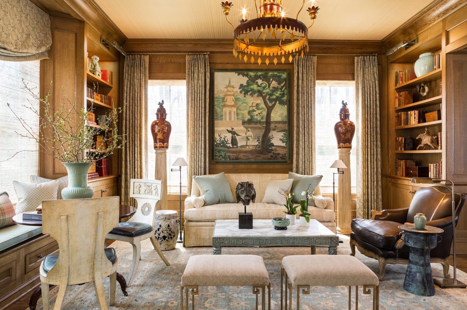
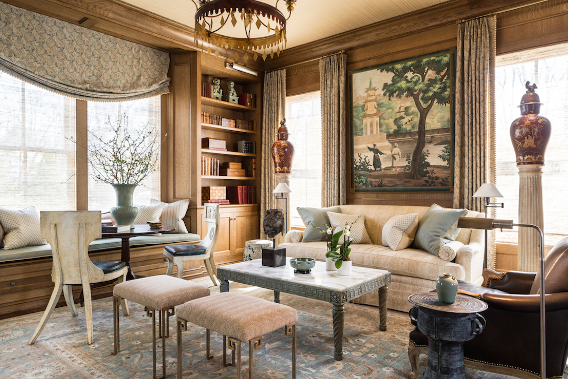
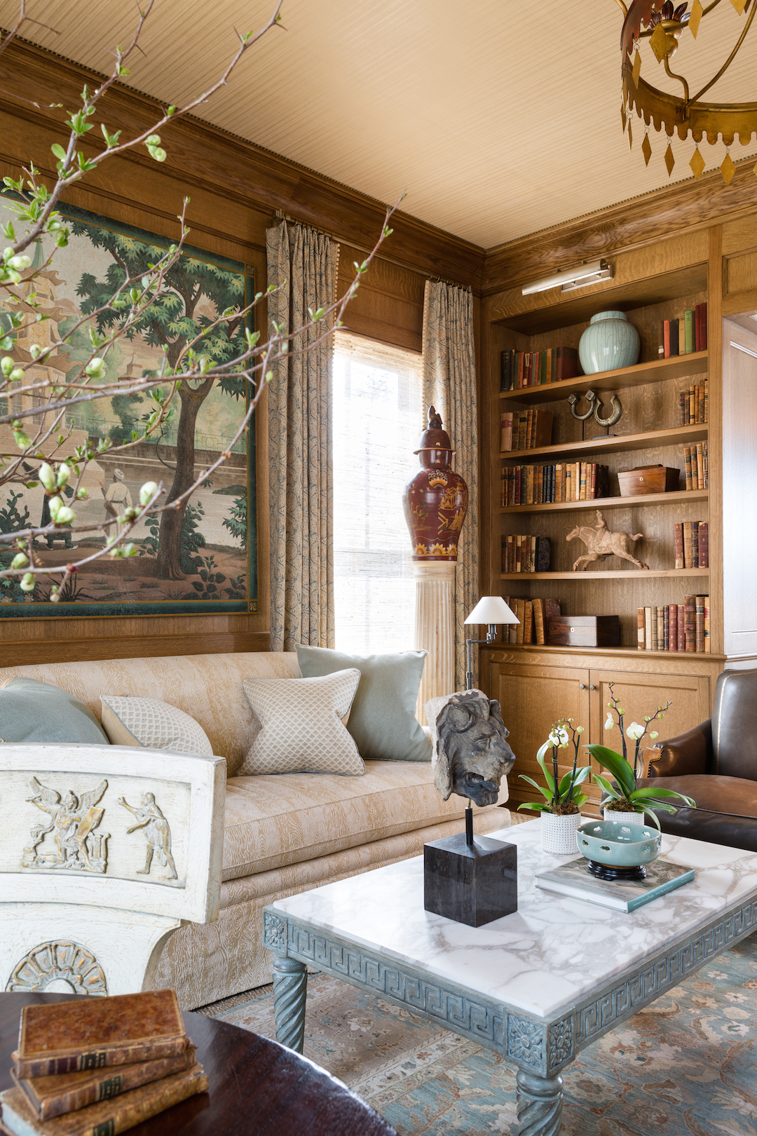
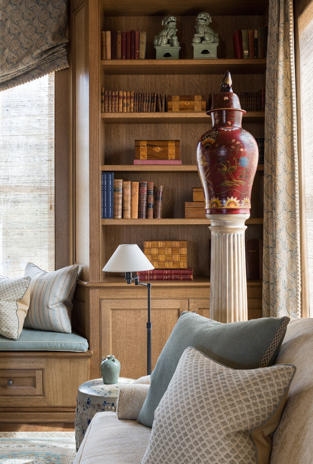
And ta da! Here is the finished room, photographed by Angie Seckinger. Flanking the sofa are a pair of bleached oak pedestals from my own collection, topped with a magnificent pair of bisque painted rooster jars from John Rosselli. I avoided the expected side tables with lamps and went for something more dramatic. The red in the jars, the tole chandelier and the chinoiserie console on the opposite side of the room were the perfect complementary accent color I was looking for.
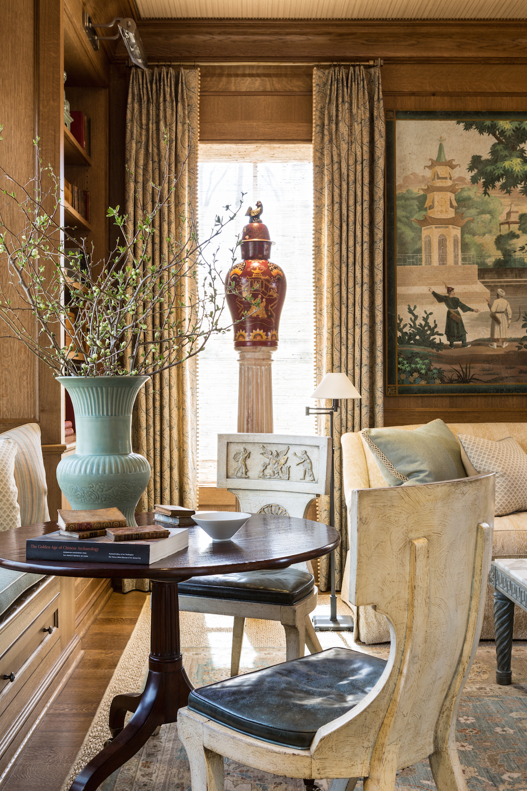
To take full advantage of the built in window seat I used a tilt top table from the Michael Smith “Jasper” collection and surrounded it with the most incredible klismos chairs (which are probably coming home with me!) I wanted to create another functional seating group where a group could amuse themselves with a card or board game and to also have an intimate dinner for four.
All of the printed fabrics in the room including the curtains, London shade and most of the pillows were from the Elizabeth Hamilton Collection. A favorite source of mine for printed fabrics. Elizabeth’s husband, Peter Fasano, made the hand screened ceiling paper, which resembles a refined grasscloth. I finished the edges of the ceiling with a nailhead trim from Samuel and Sons. The “Greek Key” benches are a part of the new collection I recently designed for Salvations Architectural Furnishings. I liked how the Greek key in the benches and John Rosselli, marble topped cocktail table give a subtle nod to the Greek Revival details found throughout the house.
I wanted the room to have a relaxed formality to it and for it to have a sense of history. As if the objects within had been collected over a long period of time.
For the floor I chose a hand tufted Oushak rug from Galleria Floors and layered it with a diamond patterned sisal rug underneath. The pale blues and celadon greens coordinated beautifully with the fabrics and accessories.
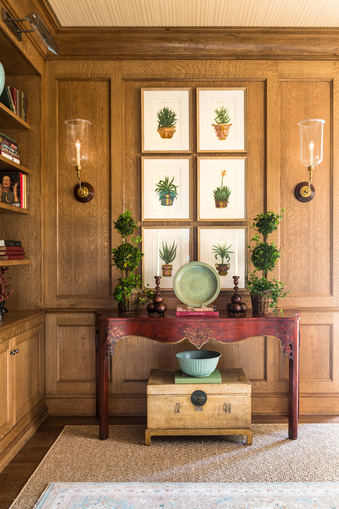
The six framed 18th century mezzotints of aloe plants from Susan Calloway Fine Arts in Georgetown were made by a German botanist and scientist. They have such a great graphic feel and the perfect punch of leafy greens. The Chinese parchment trunk underneath the Minton Spidell “Lyford”console is from my friend, Loi Thai’s fabulous and inspiring shop, Tone on Tone Antiques, in Bethesda.
A vignette showing the window seat, porcelain jars and the printed fabrics from the Elizabeth Hamilton Collection. If you haven’t yet done so, please be sure to visit the 2015 DC Design House before it closes on May 10th. Hope to see you there!


Your room honestly is the best in the house -love seeing the progression here! Of course you have the training and had the opportunity to do the entire room from scratch which definitely helped! The room is sophisticated and comfortable – excellent work 🙂
I'm just honored to have a tiny piece in your stunning library, Michael. So beautifully layered, appointed and finished. Congrats on all the press. Happy spring! Cheers
Dear Mr. Hampton,
I have been a admirer of your blog for a while , and although I have wanted to write numerous times to thank you for your beautiful work, I had to stop and take the time to compliment the above space. In a world that assaults our sensibilities each day , the beauty and grace of this room illustrates that refinement and good taste still exists.
Again thank you,
Andrew M
Amazing transformation, with lots of vignettes. Elegant and calming.
I like the idea of using the pillars and jars in front of the windows.
Again, your showhouse rooms do not disappoint! Your work is stunning and that room was one of the most spectacular rooms in the DC showhouse. I love your work and your own artwork as well. It is a pleasure to know you and I admire your perfectionist eye! xo Nancy